
Redesigning the onboarding for the Geocaching app.
Type
University project
Tools
" height="29.995132867132952px" id="Pt1MrmRxm" width="29.995132867132952px"/><path d="M 0 3.515 C 0 1.574 1.574 0 3.515 0 L 7.03 0 L 7.03 3.515 C 7.03 5.456 5.456 7.03 3.515 7.03 C 1.574 7.03 0 5.456 0 3.515 Z" fill="rgb(36, 203, 113)" height="7.030153846154008px" id="UsTjEgRiz" transform="translate(7.972 18.503)" width="7.02998601398599px"/><path d="M 0 0 L 0 7.03 L 3.515 7.03 C 5.456 7.03 7.03 5.456 7.03 3.515 C 7.03 1.574 5.456 0 3.515 0 Z" fill="rgb(255, 114, 55)" height="7.029986013986218px" id="BjLNftDFH" transform="translate(14.979 4.448)" width="7.03015384615378px"/><path d="M 3.515 7.03 C 5.456 7.03 7.03 5.456 7.03 3.515 C 7.03 1.574 5.456 0 3.515 0 C 1.574 0 0 1.574 0 3.515 C 0 5.456 1.574 7.03 3.515 7.03 Z" fill="rgb(0, 182, 255)" height="7.03015384615378px" id="tSGDRBMxX" transform="translate(14.979 11.497)" width="7.030069930069885px"/><path d="M 0 3.515 C 0 5.456 1.574 7.03 3.515 7.03 L 7.03 7.03 L 7.03 0 L 3.515 0 C 1.574 0 0 1.574 0 3.515 Z" fill="rgb(255, 55, 55)" height="7.030153846154008px" id="CogGJnjiB" transform="translate(7.972 4.448)" width="7.02998601398599px"/><path d="M 0 3.515 C 0 5.456 1.574 7.03 3.515 7.03 L 7.03 7.03 L 7.03 0 L 3.515 0 C 1.574 0 0 1.574 0 3.515 Z" fill="rgb(135, 79, 255)" height="7.02998601398599px" id="z1wnQ20Xg" transform="translate(7.972 11.497)" width="7.02998601398599px"/></g></svg>)
Figma
" height="30px" id="Cy5qD0trk" width="30px"/><path d="M 13.608 0 L 10.886 0 L 13.156 3.987 L 8.165 0 L 5.443 0 L 7.939 4.87 L 2.722 0 L 0 0 L 2.722 6.204 L 0 18.61 L 2.722 18.61 L 7.939 5.32 L 5.443 18.61 L 8.165 18.61 L 13.156 4.431 L 10.886 18.61 L 13.608 18.61 L 18.599 3.105 L 13.608 0.006 L 13.608 0 Z" fill="rgb(28, 28, 30)" height="18.6097215189875px" id="wTatIhCxG" transform="translate(6.342 5.734)" width="18.599468354430428px"/></g></svg>)
Miro
At a Glance
After researching different applications and websites to analyse user flows, I have selected the Geocaching App to refine the onboarding flow and prototype an improved version.
What is Geocaching?

Current onboarding teardown


Straight after signing up, users are shown premium packages without seeing the app.


Get started modal appears for new users with “view goals” lets have a look.

Checkbox list of goals appear with no instruction or sequence on how to finish these.

Checkbox makes you think tapping it, will tick it. Instead, it shows a small body of text, that also gives no guidance for new users.
Good bits:
The app uses a freemium approach. It does not require users to subscribe to their service to use the app but will show a popup to the the user that the option is available
Explains clearly to users why location services are needed
Not-so-Good bits:
New users are forced to sign up on entry before they have a chance to try the app. If new users are not as motivated, this may feel like a barrier to trying out this app. If this was a well-known game it might not be a problem. It is important to consider asking for signup after users have seen the value this app brings.
Right after sign up, new users are immediately asked to sign up for premium. These users have yet to even try the app or see it for its value. Premium subscription prompt can show up later, after the user has had more experience.
The get started modal takes you to some “goals” but the page does not show you how to finish these goals and expects you to understand and explore yourself.
Their attempt at having a “task list” yet, the tasks are quite linear . “Choose a cache”, “navigate to a cache” and “post a log” are vague. There are no connections and no explanations on what steps to take to find a cache. It is not new-user friendly. By the time they have successfully achieved the goal of “finding a cache” by themselves, they may not be considered a “new user” anymore and these onboarding goals popping up randomly could become annoying rather than helpful or encouraging.
Improvement ideas
Move the sign up page to later on in the app
Remove the premium popup from initial sequence
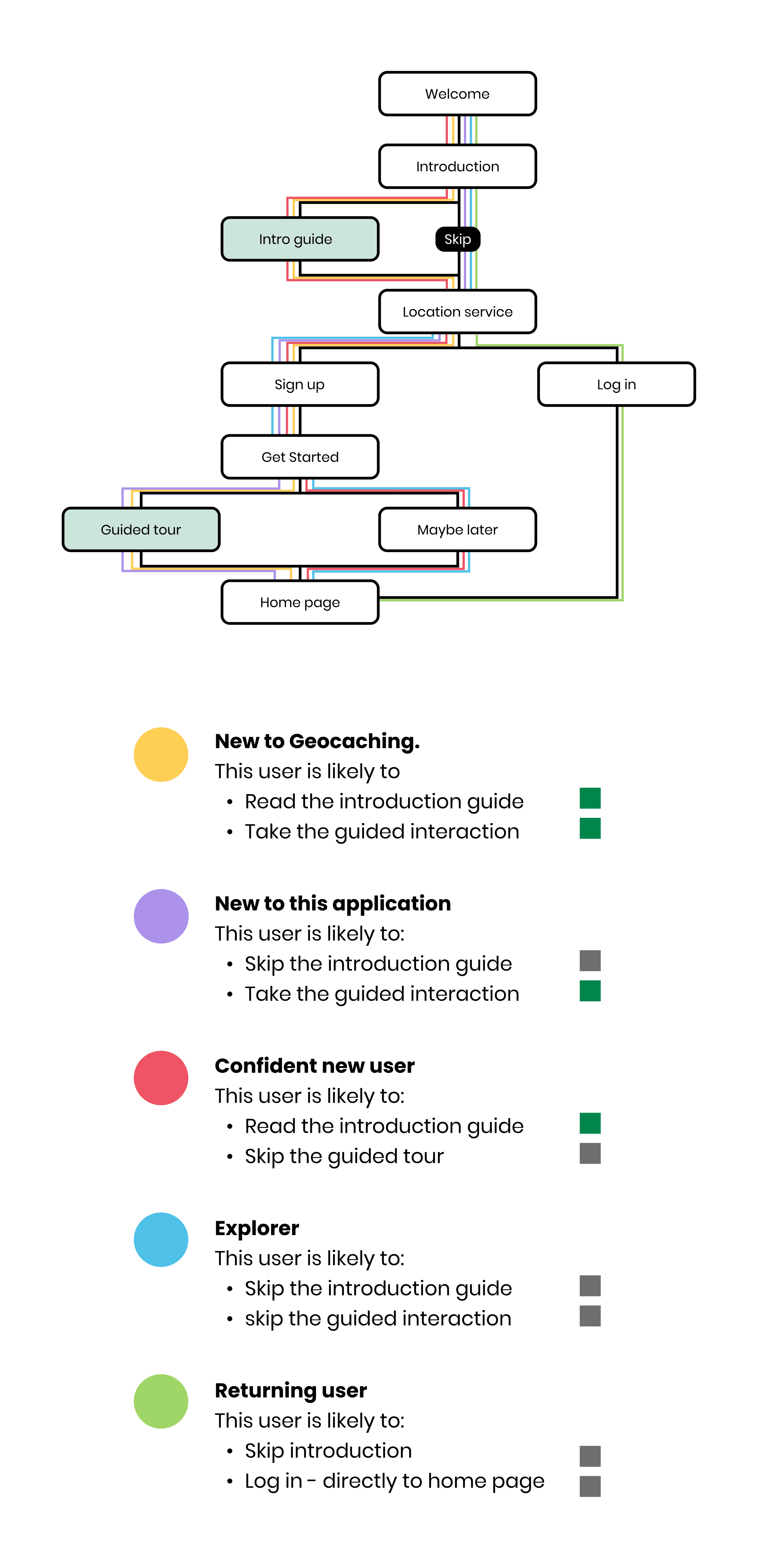
Allow for skipping/maybe later for the introduction slides
Replace the get started goals with a guided tour of the app
Initial concepts
1
Intro Tutorial

Goal: Introduce the app and give a tutorial simultaneously
Located before sign up
Carousel format
Starts with an explanation
Animated demonstration
User swipes to the next page which is a “try it out” page that simulates a feature in the app for the user to practice doing.
Full carousel of main features shown to user.
Can be skipped
2
Guided Tour

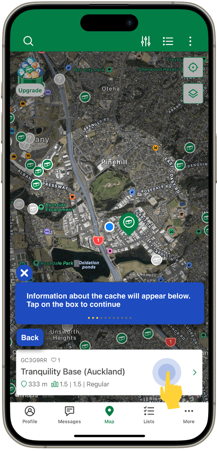
Goal : Show user how to find a geocache.
Located after signup
Step by step what to do
Complete each mini task to go to the next step
Finish tour by finding their first geocache
User needs to be outdoors ready to walk around
Can be found later in if skipped.
3
Tooltip Tutorial

Goal : Help familiarise users where to find tools to browse and explore by themselves later on.
Located after signup
The tutorial is more similar to a carousel “click next” format for the next tip.
User can be at home learning about the tools in the app first.
Can be skipped
Final concept - combination of all 3

Combines aspects of the 3 concepts
Introduction at the start (no tutorial here)
Guided tour with tasks and tooltips to finding to a geocache.
Consideration:
Users should be prepared to venture outdoors to locate a geocache during the tour.
Combat:
Users are given the option to find/complete the tour at a later time if they wish.
Best Practice Considerations
Lofi wireframes


Usability Testing
Unmoderated usability test
Goals: Determine the user experience of the onboarding sequence of the geocaching app.
Length: Approximately 10-20 minutes
Participants: Three females, two males, between the ages of 20-45
Task: Open up the app, follow the onboarding sequence and try to understand the features as a new user
Findings & Insights
Insight 1
Users value flexible navigation options during the guided tour.
This includes having the option of exiting the tour, different ways to navigate next and being able to move forward and backwards in the tour. This preference arises from user's need for control and autonomy, allowing them to choose how to proceed rather than feeling restricted by the tour's linear structure.
“I think it could be nice to have an option to exit the tour during the tour if people want to leave it”
Insight 2
Users appreciate clear and easy directions during the guided tour to keep them informed.
Users prefer having all information readily visible on one page, eliminating the need for scrolling or searching. Furthermore, they find a progress indicator useful for tracking their progress throughout the tour. Because of the nature of a guided tour, users anticipate guidance at every step, without encountering pages inadequate instructions.
“Only confusing thing is i was waiting for an action bubble to pop up on the details page”
Heuristics


Key Learnings
Onboarding isn’t one-size-fits-all
I learned that there is no single formula for onboarding. Each sequence needs to be tailored to the product, with the right practices working together to create a cohesive and engaging experience.
Design is never finished:
This project showed me that even well-established applications can benefit from improvement. It reinforced the importance of iteration, exploring multiple solutions, and weaving in elements like emotional design.